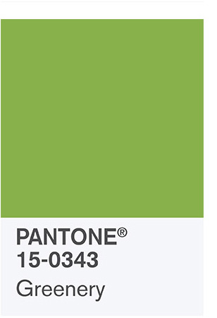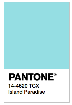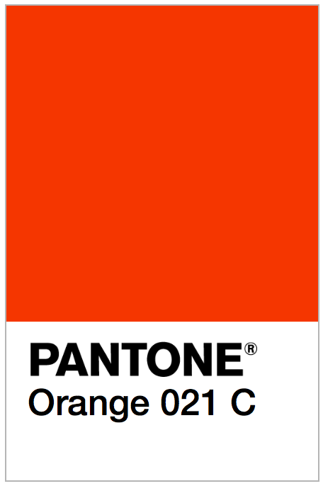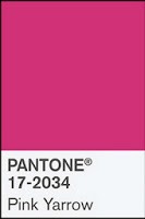
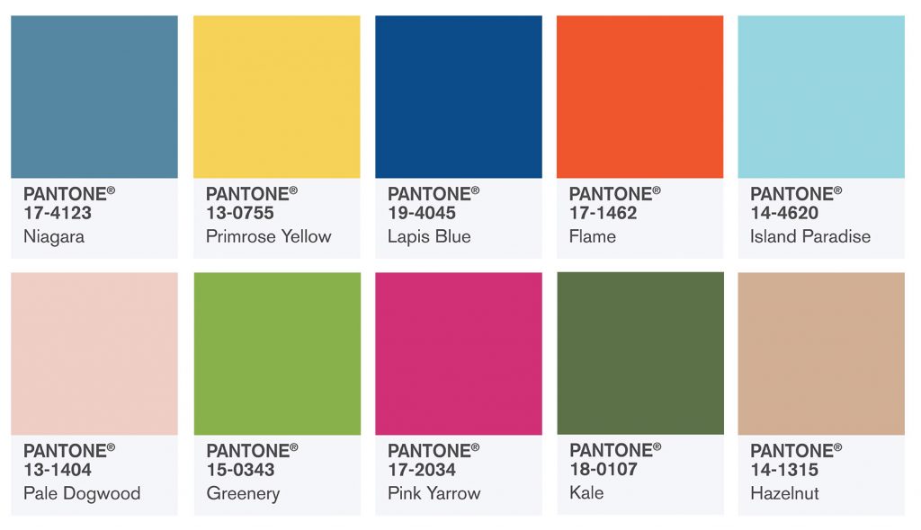
 With Pantone’s release of their color picks for Home + Interiors Spring 2017, we’re seeing a wonderful mix of bright and vibrant colors that we see often in nature. The color authority powerhouse cues a brilliant mix of “vitality, relaxation and the great outdoors.”
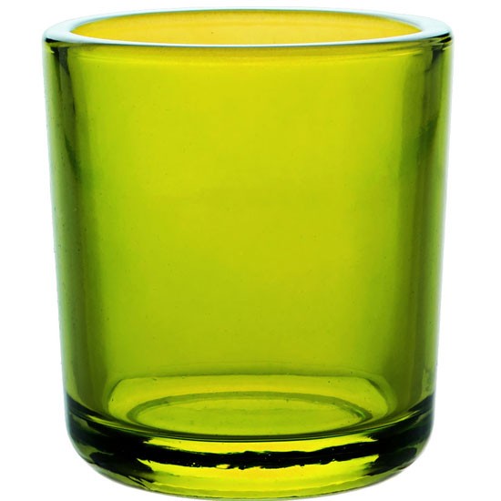
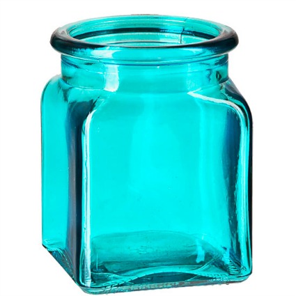
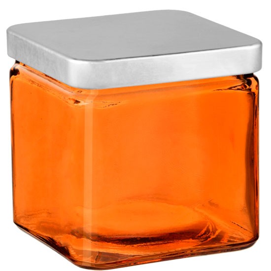
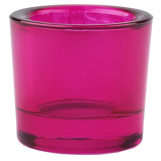
While clear glass tend to be the most popular choice for candle packaging, adding a little trendy pop of color to your packaging will make a bold statement for your brand and have you on target for customers constant desire for something new.
Pantone’s executive director Leatrice Eiseman says, “We are all familiar with consumers’ constant desire to see something new, yet they still want, in many cases, to have somewhat of a familiar comfort level,” said Eiseman. “We have to assess our customers’ aspirations by using credible forecasts as a guide to invigorated color design palettes that will inform and encourage new color directions. The question is: What can we do to tweak our color palettes to make consumers stop and take notice?”
Eiseman unveiled Pantone’s Home + Interiors view for 2017 at the International Home + Housewares Show. Included were nine distinctive palettes with a nature-centric theme: Day Dreaming, Art Ease, Native Instincts, Florabundant, Acquired Taste, Forest Bathing, Reminiscence, Raw Materials and Graphic Imprints.
Here we feature some of favorite colors + corresponding candle packaging from those soon-to-be trending palettes.